- Before you get Started
- Data Visualization in R: base vs. ggplot2
- ggplot2 -- Basics and Aesthetics
- ggplot2 -- Geoms and Layers
- ggplot2 -- Styling and Saving
Before you get Started
Before starting this R tutorial, you should know how to
- Open R and execute commands.
- Differentiate data structures such as vectors, matrices, and data frames.
If you do have any questions, or if you think I should add something to this document, please email me!
Data Visualization in R: base vs. ggplot2
The purpose of this document is to get you up and running with basic graphics in R. R has many innate graphics capabilities that come with R the moment you download it and open it. These are called ``base graphics'' since they are technically included in the base package, which comes with R and is automatically loaded when you open it.
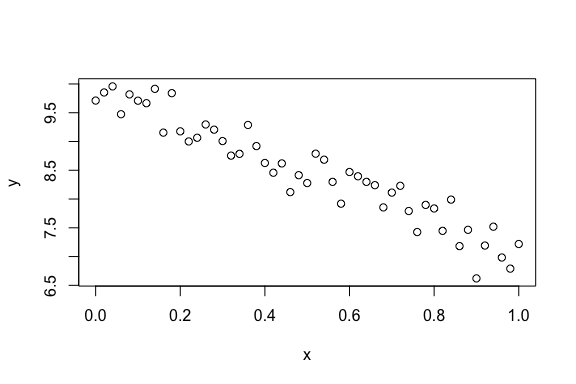
A good example of base graphics is the plot() function, which -- you guessed it -- can make some basic plots. For example, you can make a scatterplot of two vectors with the plot() function:
# make some fake linear data to plot
set.seed(3)
n <- 51
f <- function(x) -3*x + 10
x <- seq(0, 1, length.out = n)
y <- f(x) + rnorm(n, sd = .3)

# use plot()
plot(x, y)
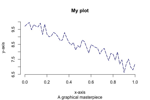
There are tons of options you can give to the plot() function, see ?plot for a non-exhaustive, and yet still exhausting, listing of options that I won't talk about here. To give a small sampling:
plot(x, y, type = "l", col = "darkblue", lty = 5, lwd = 1.5,
  main = "My plot", sub = "A graphical masterpiece",
  xlab = "x-axis", ylab = "y-axis", frame.plot = FALSE)
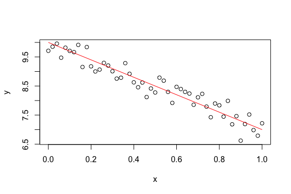
Other base graphics functions include hist() and curve(). hist() makes histograms, and curve() is used to plot functions (f(x)).
hist(y)

plot(x, y)
curve(f(x), col = "red", add = TRUE)
There are packages other than base that create graphics. The two most popular are lattice and ggplot2. To install them you simply use, for example, install.packages("ggplot2"). In this crash course we'll use ggplot2 exclusively. There are many reasons why we will prefer ggplot2 to base, but the most important are the following:
- It's easier to learn, since the names of the plotting functions are more systematic.
- It's much more popular in use.
- It has a much better documentation system, see http://docs.ggplot2.org/current/.
- It protects users against graphical don'ts, like having multiple scales for the same graphical component.
It is also much more extensible: it's easier to add on your own graphics.
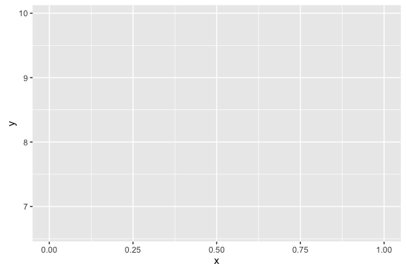
An easy, but misleading, way to start uses the qplot() function. Here's how you'd make a simple scatterplot using ggplot2:
library(ggplot2)
qplot(x, y)

As a first observation of why ggplot2 graphics are better, look at the margins on the created plot. Does the ggplot2 graphic seem larger? It isn't, in fact it's exactly the same size. ggplot2 is much better at managing its margins, and as a consequence doesn't waste a lot of space to big white margins like the base graphics that we've made.
ggplot2 -- Basics and Aesthetics
Why does ggplot2 have such a strange name? The "gg" on the front stands for "grammar of graphics", which is a systematic way of thinking about graphics. Instead of getting into the grammar, let's just see how it works.
To get started, note that every plot begins with a call to ggplot(). ggplot() takes two arguments: the first is a dataset (a data.frame object) and the second is a call to aes(), where you assign variables in the dataset to components of the graph called aesthetics. Let's start by putting our variables x and y into a data frame called df:
df <- data.frame(x = x, y = y)
head(df)
#      x        y
# 1 0.00 9.711420
# 2 0.02 9.852242
# 3 0.04 9.957636
# 4 0.06 9.474360
# 5 0.08 9.818735
# 6 0.10 9.709037
From there, let's make the background layer of the plot we want to make using the ggplot() function:
library(ggplot2)
ggplot(df, aes(x = x, y = y))
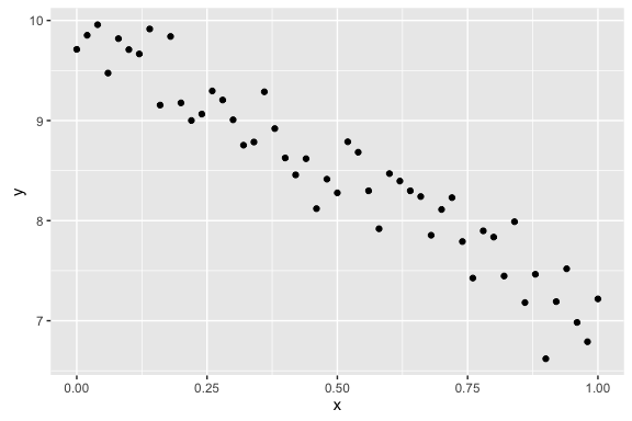
Not a very useful graphic, huh. Here's the interesting point: to make various graphics, you just put layers on top of the background axes/panel made with ggplot(). These are made with layers created with functions that look like geom_*(), where different plots come from different replacements of *. For example, a simple scatterplot is generated with geom_point():
ggplot(df, aes(x = x, y = y)) +
  geom_point()
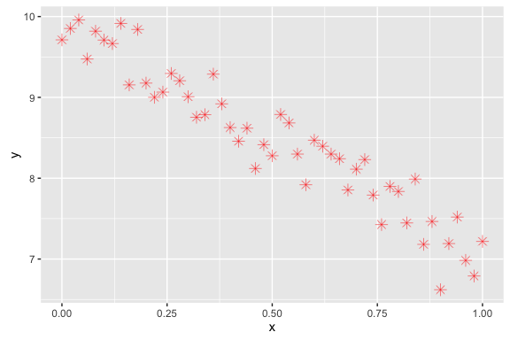
This may seem like a really complicated way to do something that base's plot() already does with the much simpler code plot(x, y). We'll soon see that that notion is very misleading. For example, if we want to change visual aspects of the points in the scatterplot, geom_point() has a really wide range of flexibility. For example, color = "red" makes the points red; size = 3 makes the points bigger (default is 1.5); alpha = 1/2 makes the points semi-transparent, so that 2 points need to stack to make perfectly opaque black; and shape = 8 changes the shapes of the points from the solid black dots to asterisks.[1] Here's an example of doing all those at once:
ggplot(df, aes(x = x, y = y)) +
  geom_point(color = "red", size = 3, alpha = 1/2, shape = 8)
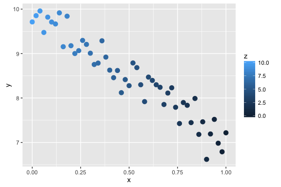
While that's nice, it gets even better! If we have another variable in the dataset, we can assign an aesthetic (e.g. color, size, alpha, or shape) to the other variable and ggplot2 will (1) find a good range (scale) for the variable , (2) change the points accordingly, and (3) make a legend for you, all automatically! For example, below I add a new variable z to the dataset; z ranges from 10 to 0 as x ranges from 0 to 1:
df$z <- seq(10, 0, length.out = n)
head(df)
#      x        y    z
# 1 0.00 9.711420 10.0
# 2 0.02 9.852242  9.8
# 3 0.04 9.957636  9.6
# 4 0.06 9.474360  9.4
# 5 0.08 9.818735  9.2
# 6 0.10 9.709037  9.0
We use the aes() function whenever we are assigning variables in the dataset to aesthetics; we only don't use aes when we are setting global values for an aesthetic, like we did above. In this graphic, we use both aesthetic assignment and setting:
ggplot(df, aes(x = x, y = y)) +
  geom_point(aes(color = z), size = 3)
ggplot2 -- Geoms and Layers
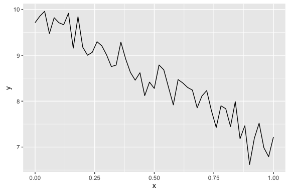
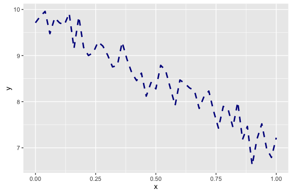
But that's not all ggplot2 can do. geom stands for "geometric object", and it controls what kind of graphic is made. For example, if we want to make a line chart, we can simply use geom_line() instead of geom_point().
ggplot(df, aes(x = x, y = y)) +
  geom_line()
Of course, aesthetics govern aspects of the line drawn, too. Here's an example. If you're ever wondering what aesthetics contribute to what geoms, simply type ?geom_line (for example). Note that different geoms might have slightly different aesthetics, for example, it makes sense to talk about a point's shape (i.e. the shape aesthetic in geom_point()), but that doesn't make sense for a line. Similarly, it makes sense to talk about the type of line (like dashed, with the linetype aesthetic of geom_line()), but not of a point.
ggplot(df, aes(x = x, y = y)) +
  geom_line(color = "darkblue", linetype = 2, size = 1)
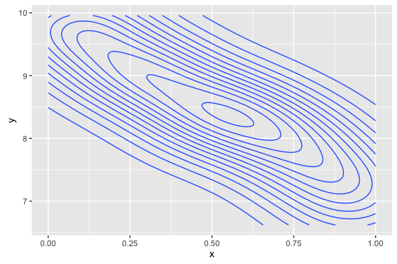
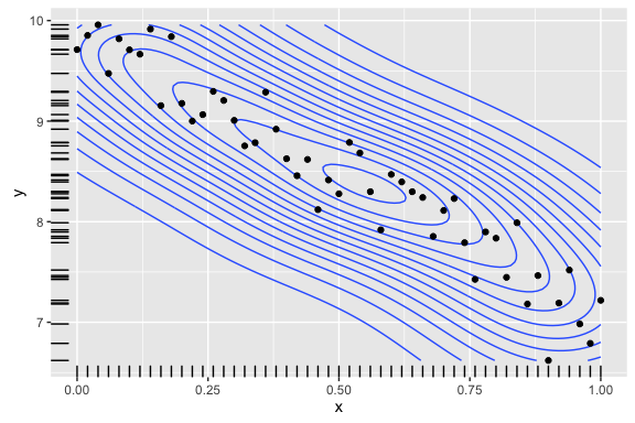
We've got more than just points and lines with ggplot2 though. For example, we can do contour plots (two-dimensional kernel density estimators):
ggplot(df, aes(x = x, y = y)) +
  geom_density2d()
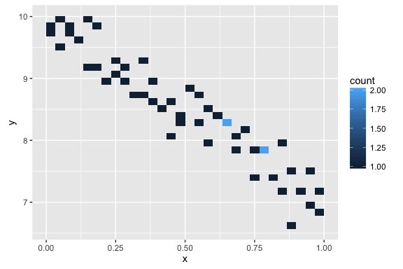
 or two-dimensional histograms (not very interesting here):
ggplot(df, aes(x = x, y = y)) +
  geom_bin2d()
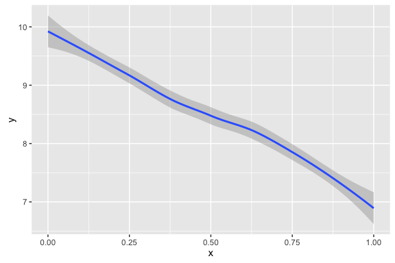
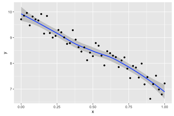
 We can even fit a smooth line to the data (a LOESS/GAM smoother):
ggplot(df, aes(x = x, y = y)) +
  geom_smooth()
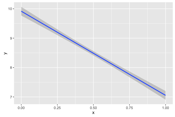
 If we want the simple linear regression line, we do this
ggplot(df, aes(x = x, y = y)) +
  geom_smooth(method = "lm")
Here's one of the best points of ggplot2: you can layer the geoms! For example, if we want to add a point layer on top of a smoother layer, we can do
ggplot(df, aes(x = x, y = y)) +
  geom_smooth() +
  geom_point()
 If we want to layer in the density layer, and add marginal ``rug'' plots, we can do:
ggplot(df, aes(x = x, y = y)) +
  geom_density2d() +
  geom_rug() +
  geom_point()
You can add as many variables/aesthetics to a plot as you want. As you can tell, these plots can get pretty complicated pretty quick. Just like Uncle Ben said: with great power comes great responsibility, and here that means restraint. More stuff in the plot does not make it better, and can easily make it a worse plot by confusing what the reader is actually supposed to learn from it.
Other common plots
This section contains a potpurri of other common graphics in ggplot2. Before we get started, it'll be helpful to add a few categorical variables to the dataset; we'll call these a} (binary) andb}
df$a <- sample(c("H", "T"), size = n, replace = TRUE)
df$b <- sample(c("a", "b", "c", "d"), size = n, replace = TRUE)
head(df)
#      x        y    z a b
# 1 0.00 9.711420 10.0 H b
# 2 0.02 9.852242  9.8 T c
# 3 0.04 9.957636  9.6 T b
# 4 0.06 9.474360  9.4 H a
# 5 0.08 9.818735  9.2 H a
# 6 0.10 9.709037  9.0 H b
One dimensional graphics
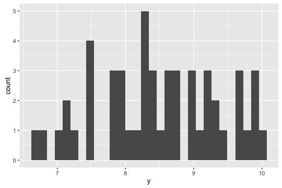
Histograms, bar charts, and kernel density estimators are all univariate graphics: they are meant to help you understand the distribution of one variable in your dataset, marginally. Consequently, you only need to tell ggplot2 one aesthetic for these, the x aesthetic, regardless of what the name of the variable is. Here's how you make a histogram:
ggplot(df, aes(x = y)) +
  geom_histogram()
# `stat_bin()` using `bins = 30`. Pick better value with `binwidth`.
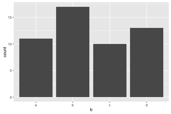
A bar chart is similar to a histogram, but is used for discrete/categorical/ordinal data:
ggplot(df, aes(x = b)) +
  geom_bar()
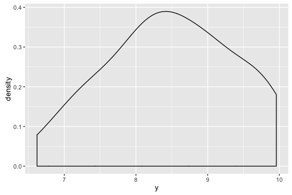
The kernel density estimator functions like a smooth histogram, a smooth estimate of a PDF (f(x)). You make one like this:
ggplot(df, aes(x = y)) +
  geom_density()
Two dimensional graphics
The main two-dimensional graphics you've already seen: the scatterplot (geom_point()), the smoothers (geom_smooh()), and the 2d-histograms and kernel density estimators (geom_bin2d() and geom_density2d(), respectively). These are each graphics for two continuous variables.
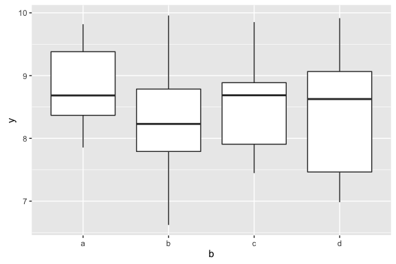
What if you have one discrete and one continuous variable? This is the situation where boxplots and violin plots are useful. They are graphics that help you understand the associations between a discrete variable (count, categorical, or ordinal) and a continuous one. Here's how you make a boxplot:
ggplot(df, aes(x = b, y = y)) +
  geom_boxplot()
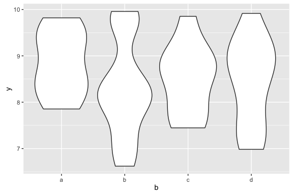
 ... and here's how you make a violin plot:
ggplot(df, aes(x = b, y = y)) +
  geom_violin()
What happens if you need to make graphics for two discrete variables? Unfortunately, ggplot2 is not very good for this situation, and the kinds of graphics (e.g. mosaic plots) require a bit more explanation. For this reason, we don't cover those graphics in this tutorial.
ggplot2 -- Styling and Saving
Two other components are necessary: styling and saving. Let's start with theming. The default ggplot2 is theme_gray(): that's what's giving the gray background that is so iconic of ggplot2 graphics. Another popular theme is theme_bw(), a more standard black and white type graphic:
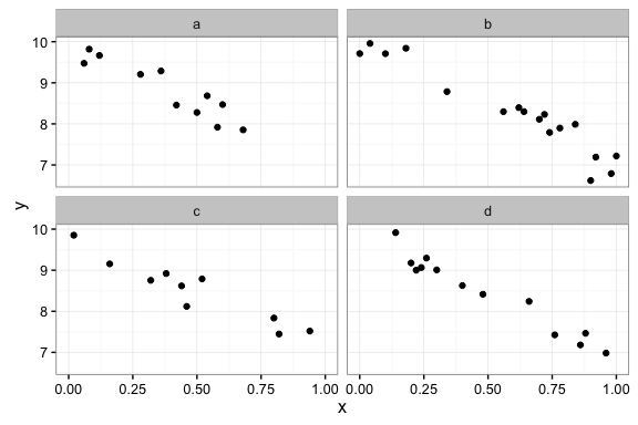
ggplot(df, aes(x = x, y = y)) +
  geom_point() +
  facet_wrap(~ b) +
  theme_bw()
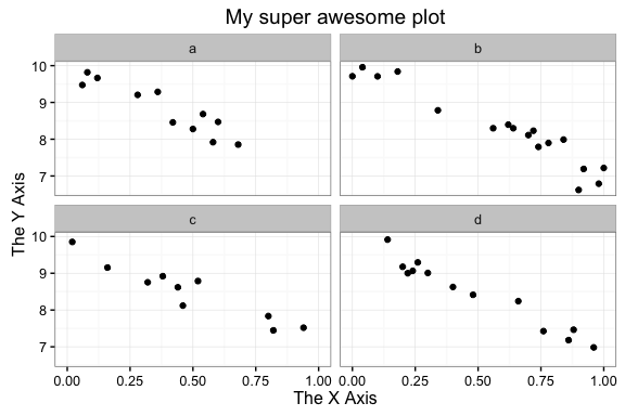
If you give a numeric argument to theme_bw(), as in theme_bw(20), it'll make all the fonts (axes titles and ticks font size) larger; the base size is 12. While we're at it, we can change the axes titles with the xlab() and ylab() functions, and set a plot title with ggtitle():
ggplot(df, aes(x = x, y = y)) +
  geom_point() +
  facet_wrap(~ b) +
  theme_bw() +
  xlab("The X Axis") +
  ylab("The Y Axis") +
  ggtitle("My super awesome plot")
Now, how do you save your plots to put them into a presentation (paper or slideshow)? The function you want to use is ggsave(), and you run it after you make the plot. For example, ggsave("myPlot.pdf") makes a PDF called myPlot.pdf in your working directory (you can figure out where that is on your computer by typing getwd() in your R session). If you want to change the sizes of the graphic, you can do things like ggsave("myPlot.pdf", height = 7, width = 4).
[1] You can see the entire list of shapes, and what numbers the correspond to, by looking at the Examples section of ?points.